Difference between revisions of "Manual:Template/Example/Notification Box"
| [quality revision] | [quality revision] |
(Tag: Visual edit) |
(Tag: Visual edit) |
Contents
Template example: Notification box[edit | edit source]
To emphasize text passages, it is common to use a type of notifcation box. In this example, we create a notification box that can be used to show a warning, a tip or a note.Note: Sie können eine Infobox-Vorlage auch direkt in ihr Wiki importieren. Hierzu gibt es eine Download-Datei.
Contents
Template example: Notification box[edit | edit source]
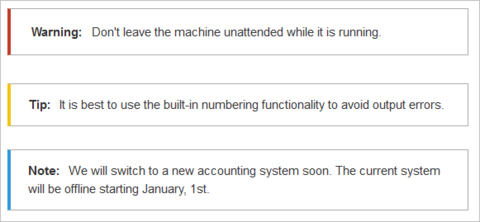
The color of the box and the box label change automatically depending on the type of box a user selects.
Creating the template[edit | edit source]
- Create the page Template:Box Note
-
Add the template content and save the page:
What this code does:
                            <div class="infobox notification-{{{boxtype}}}">
<span class="boxlabel">
{{#switch: {{{boxtype}}}
 | note = NoteHinweis:
 | tip = TipTipp:
 | warning = WarningAchtung:
 | example = Beispiel:
 | important = Wichtig!
 | backgroundbox =
 | #default = NoteHinweis:
}}
</span>
{{{Note text}}}
</div>
-
The container (
<div>...</div>) is used for styling the box. It has the style classes infobox and{{{boxtype}}}. The boxtype parameter provides the actual value the user chooses when using the template. -
The
<span>...</span>contains the label for the box. It displays the label for the box type the user chooses. It has the style class boxlabel which is used to format the label. -
{{{Note text}}}is the placeholder for the actual text the user creates on a particular page.
To make it easy for users to insert and use this template in visual editing mode, we include a <templatedata> section in the template. It is wrapped in a <nowiki>...<nowiki> tag to ensure that this part of the template is not transcluded in the target page that uses the actual template. This template sections function is to describe the parameters of the template. It also populates the form for visual editing:
                    <div class="infobox notification-{{{boxtype}}}">
<span class="boxlabel">
{{#switch: {{{boxtype}}}
 | note = Note:
 | tip = Tip:
 | warning = Warning:
 | example = Example:
 | important = Important!
 | backgroundbox =
 | #default = Note:
}}
</span>
{{{Note text}}}
</div>

<noinclude>
<templatedata>
{
	"params": {
		"boxtype": {
			"description": "Possible values: note, tip, warning,example, important, backgroundbox",
			"example": "note",
			"type": "string",
			"default": "note",
			"required": true
		},
		"Note text": {}
	},
	"description": "To add standard infoboxesinfo boxes such as notes or relatedwarnings links to a page"
}
</templatedata>
</noinclude>
What this code does:
- It lists the two parameters (boxtype and Note text), separated by a comma.
- It lists the parameter objects (optional): description, example, type, etc. For a full ist of template data objects, see www.mediawiki.org/wiki/Extension:TemplateData#Param_object
- It describes the purpose of the template (description) so that users can distinguish it from similar templates.
Creating the template styles[edit | edit source]
To style the notification box, we have assigned three style classes:
- infobox: Container for the infobox. We can specify layout properties such as border, background or padding
- notification-{{{boxtype}}}: Used for color-coding the box based on what type of box a user wants to insert on a page.
- boxlabel: Styling of the box label.
Since we want to load the styles only when this template is used on a page, we create the stylesheet page as a subpage of the template.
To create the styleheet:
- Create the stylesheet page:Template:Box Note/styles.css
- Add the styles and save the page:
                    /* Box Note*/
.infobox {
	padding: 1em;
	margin: 2em 0;
	border:1px solid #ccc;
}
.infobox p {
	padding: 0;
	margin: 0;
}
.boxlabel {
	font-weight:bold;
	padding-right:0.5em;
}
.notification-note {
border-left: solid 4px #3498db;
}
.notification-tip {
border-left: solid 4px #f2c412;
}
.notification-warning {
border-left: solid 4px #c23c2b;
}
.notification-backgroundbox {
background:#ffd67f;
padding:12px;
}
.notification-backgroundbox .boxlabel {
display:none;
}
                    <templatestyles src="Template:Box_Note/styles.css" />
<div class="infobox notification-{{{boxtype}}}">
    ....
Using the template[edit | edit source]
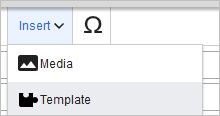
To create a notification box on a page:
-
Select Insert > Template in visual editing mode:
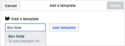
-
Select the template Box Note and click Add template:
-
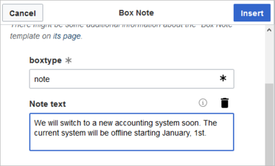
Enter the name for the type of box you want to create, for example note:
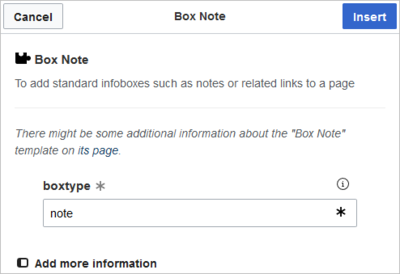
- Click Add more information
-
Click Note text and enter the text for your notification box:
-
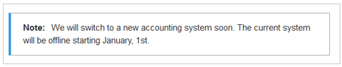
Click Insert. The notification box is now included on your page:
Save the page if you have no further edits to make.
To later edit the notification in visual editing mode, simply double-click the notification and the template dialog window opens.